The 10 very best Interactive Sales Stories

Let's start with the best: Apple has been showing superiority for years
What is it about?
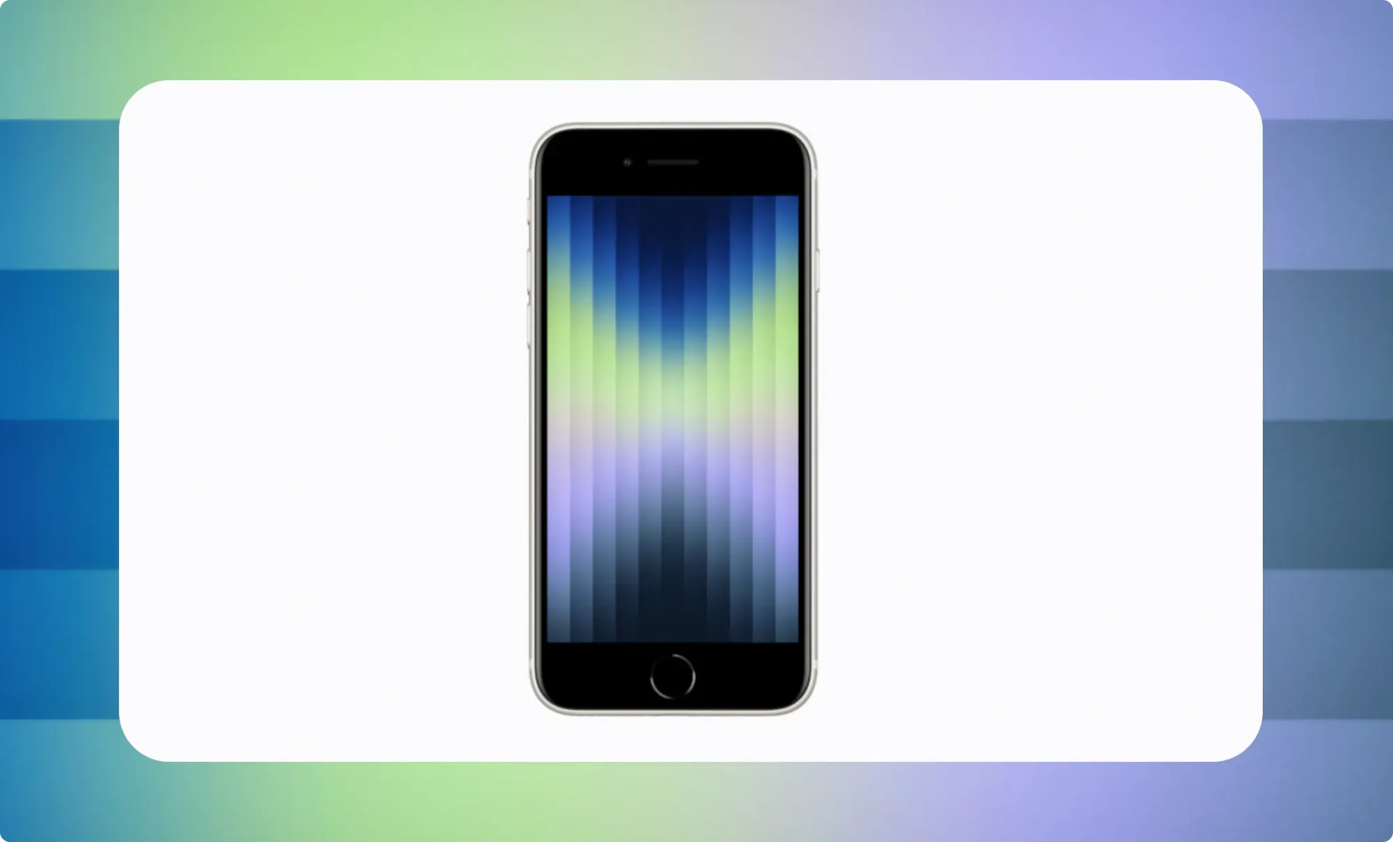
Apple continues to live up to its title as emperor of interactive sales stories. With each new flagship model, the brand raises the bar again. For the launch of the iPhone 16 Pro, Apple created a showcase that demonstrates what happens when design, copy and technology are fully in sync.
What's between the tags?
From the first scroll, you feel: this is premium. The intro opens with an atmospheric 3D animation that almost ceremoniously unveils the iPhone 16 Pro. The copy is controlled, precisely timed and exudes the self-confidence of a premium brand. Everything here is about experience and proof.
Technically and visually, this story is bursting with finesse: subtle parallax effects, cinematic transitions and small motion details that you almost don't notice - but which make you feel that everything is right down to the last detail. The structure is logical: first the big wow, then the compelling why, and finally the compelling CTAs that are subtly but purposefully poised.
What stands out: Apple dares to go long. Every element is given breathing room. There is no fear of unpacking details - as long as they contribute to the larger story. This is level storytelling, where every animation, every word, every transition plays a part in the whole. And so you keep scrolling. And scrolling. Until you're convinced. Or you just want to look again.
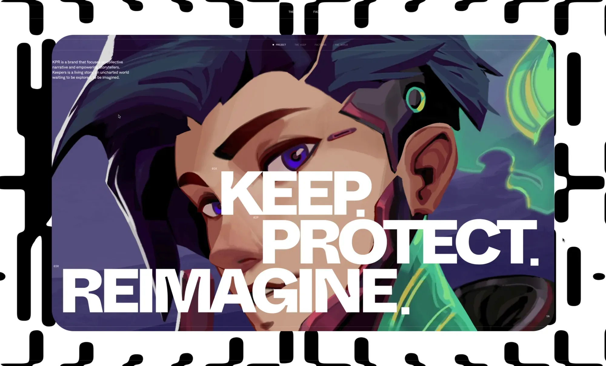
Market for NFTs or collective storytelling? Discover the world of Keeper in KPRverse
What is it about?
Genius idea: this is a vulgar marketplace disguised as a super cool scifi story. KPR is a metaverse world in which users first create an avatar and then join the fight as a 'Keeper' to preserve the new world. This "collective narrative" is funded by the users themselves, who buy and sell all sorts of "collectibles," with crypto coins.
What's between the tags?
This story first lays out a simple storyline and then elaborates it with great finesse. Essentially, it's an ordinary scroll story based on 3D images that rotate slightly as you hover over them - it looks like parallax, but it's subtle 3D. As you scroll, the images tilt away and you enter a new chapter.
A cool technique is the Click-and-hold, where you keep the mouse clicked on a chapter image. This activates the sound and makes all kinds of extra story elements appear on the chapter image. Very nice is also the use of dynamic typography at the opening of the story and at the transition between the chapters.
God is also in the details here: this story gets its high level especially by the smooth way the screen responds to scrolling, with a finesse that until now you only found in the better audiovisual motion design.
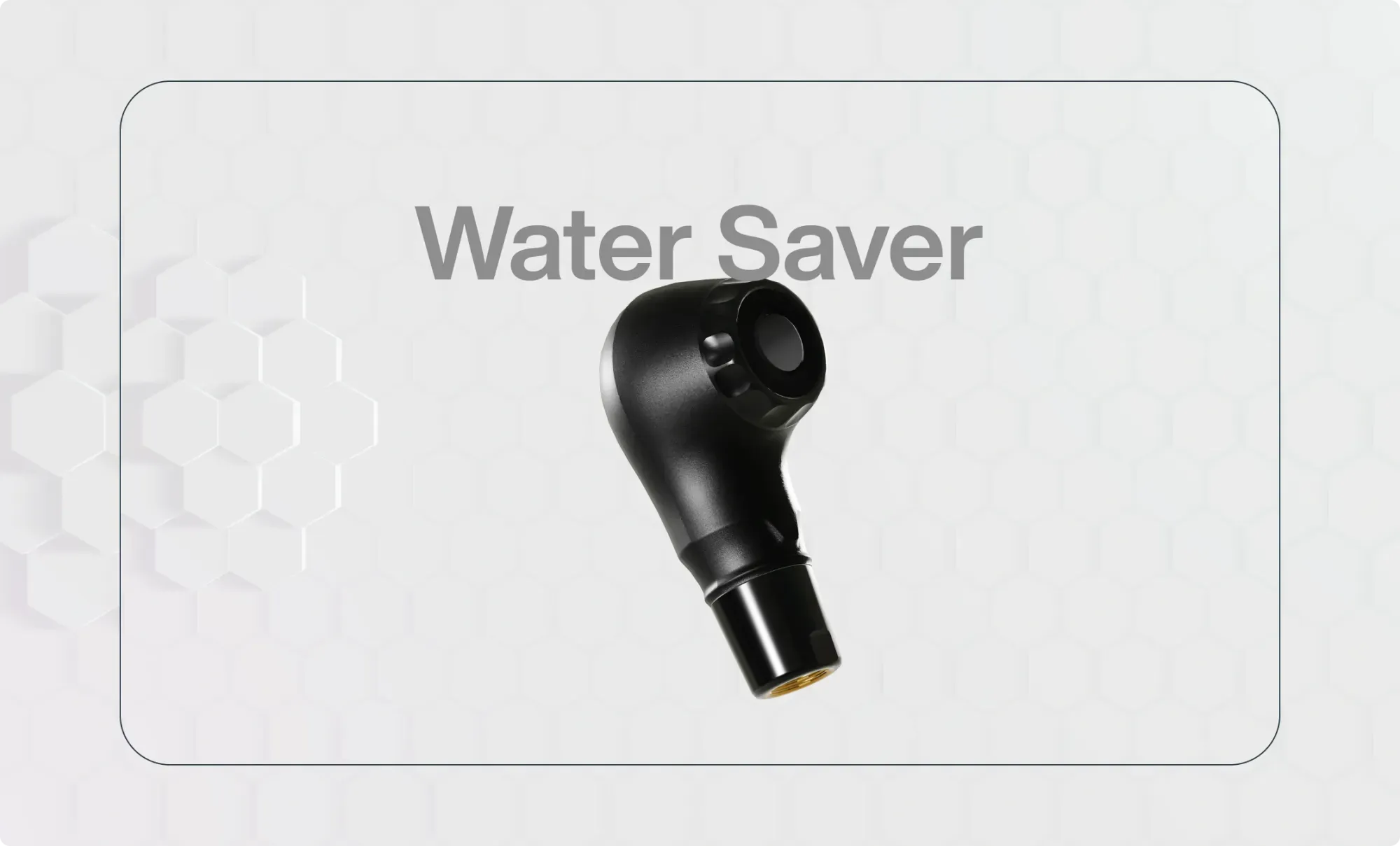
You can almost feel it in your hands: the super spray for hairdressers in 3D
What is it about?
A very special water sprayer from L'Oréal for hair salons - after watching this story, you immediately want to become a hairdresser, just to be able to use that sprayer!
What's between the tags?
This is a typical interactive story of a physical product. You open directly with your product, here in 3D, and you give the scrolling viewer the key benefits step by step. Then you strip away the skin of the 3D image and let the user look inside the product, at the technical marvels that make it so innovative.
Nicely done, this story, even with the moving 3D background, although the copy could be better (there's even a whopper of a language error in there). Still, it is mainly with the story structure that we question. Notice how this story makes a combination of purpose (a better world) and sales (buy me), and ask yourself if this works.
In our opinion, this story shows that it is better to separate these goals in content: either you work on conversion and steer the story via the hard benefits to a call-to-action, or you work on engagement and create all the space in your story to go into purpose.
In conclusion: this story shows that interactive storytelling can be used not only in B2C but certainly also in B2B.
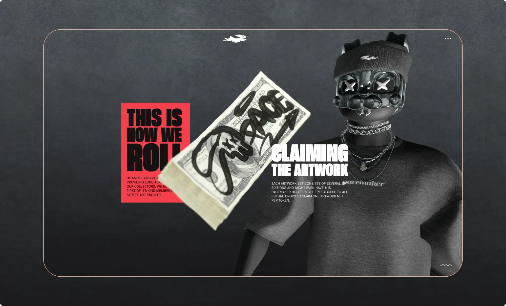
Kind of creepy 3D story, as it should be for Pacemaker streetwear.
What is it about?
Pacemaker is a streetwear brand that is now stepping into the world of non-fungible tokens (NFTs) with a "Membership Street Art Project."
On Pacemaker NFT, you first buy an NFT in the shape of a 3D bunny. Once you have that, you can buy all kinds of street art NFTs, which are offered for sale in waves in the community. Those street art NFTs, in turn, you can have them turned into exclusive physical fashion objects. Like a hat? A cool hat, though.
What's between the tags?
This story creatively relies on one 3D object: a figure whose helmet is only visible at first and who, as you scroll, gradually becomes fully visible and begins to walk across the screen. Kind of creepy? Perhaps. But definitely intriguing. And very delicately crafted.
Interactive trailer of Medal of Honor game. Don't watch if you can't stand blood and shooting
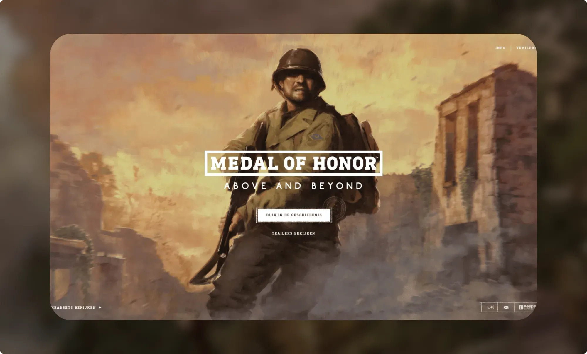
What is it about?
Project 2075 from eyewear manufacturer Oakley is a futuristic vision of tomorrow's sports world. Not a product page, not an ordinary campaign, but an interactive experience that seems to dissolve the boundaries between fiction and brand identity. What began as a way to introduce the athletes of "Team Oakley" culminated in a visually stunning and strategically thought-out universe.
What's between the tags?
You enter a digital new world where sports, technology and humanity merge. The experience starts with a graphically bold intro in which you navigate scrolling through a through an artificial metropolis. Everything feels sleek, filtered and purposeful, as befits Oakley. Every component - from the look of the interface to the animations - exudes that signature performance aesthetic.
The structure is episodic: each athlete gets his own narrative, stylized like a mini-movie. Within those frames you move through video, copy and illustration, each time with a striking sense of rhythm. You get the idea that you are reading a comic book and watching a trailer at the same time.
Like a good game or Netflix series, the power is in the worldbuilding: Oakley invites you into another universe, but with recognizable sports icons as anchor points. And that works. You feel involved, even though you know it's all fiction. The mix of motion design, soundscape and typography ensures you're not just watching or reading - you're experiencing this.
Project 2075 is not a sales story that seeks to convert with buttons or CTAs. It is an image statement that shows what a brand story anno tomorrow can be: compelling, multimedia and boldly different.
On rescue mission with the US Air Force
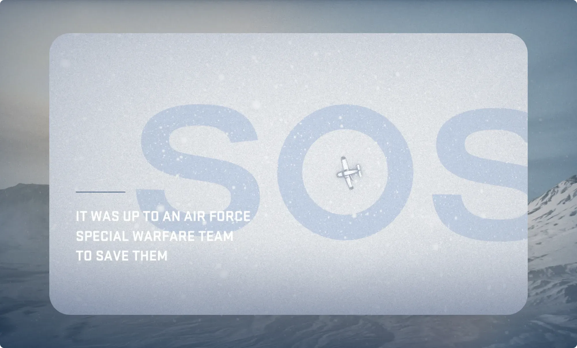
What is it about?
The US Air Force is pulling out all the stops to recruit new personnel.
What's between the tags?
The U.S. military has long used innovative storytelling techniques to attract personnel. In this interactive, we get the same technique as in the Medal of Honor trailer above: you follow a camera trail through a landscape scrolling and are given regular hotspots that you click on to view and listen to more info.
The story takes you on a rescue mission in the snowy desert of Alaska to rescue some people who crashed in a small plane far from civilization. It is based on true facts and is given a very authentic character by incorporating audio interviews with the soldiers who carried out the mission.
The screenwriters have added an additional interaction layer as a transition between scenes, in which the user has to slide a ball over a trajectory to launch the next scene. There is also a learning curve in this: the first trajectories are easy, the next ones get a little more difficult.
Creatively, this is very well made.
- You get a clever angle on this military subject (you don't drop bombs but save ordinary people),
- high level of reality (true story told by the rescue team themselves),
- a nicely constructed story (short exposition that quickly reveals the story objective, clear chapters that also include an unexpected, dramatic twist),
- professional sound support of the story with (sometimes a touch bombastic, but that may suit those who aspire to a job as a hero in the air force),
- clearly visible but not intrusive identification of the client US Airforce and calls-to-action "connect" and "apply now.
- at the end also the opportunities to revisit the story or click through to other similar stories.
We're not big war fans, but this is puffy work.
Thrilling! The fabulous Playstation5
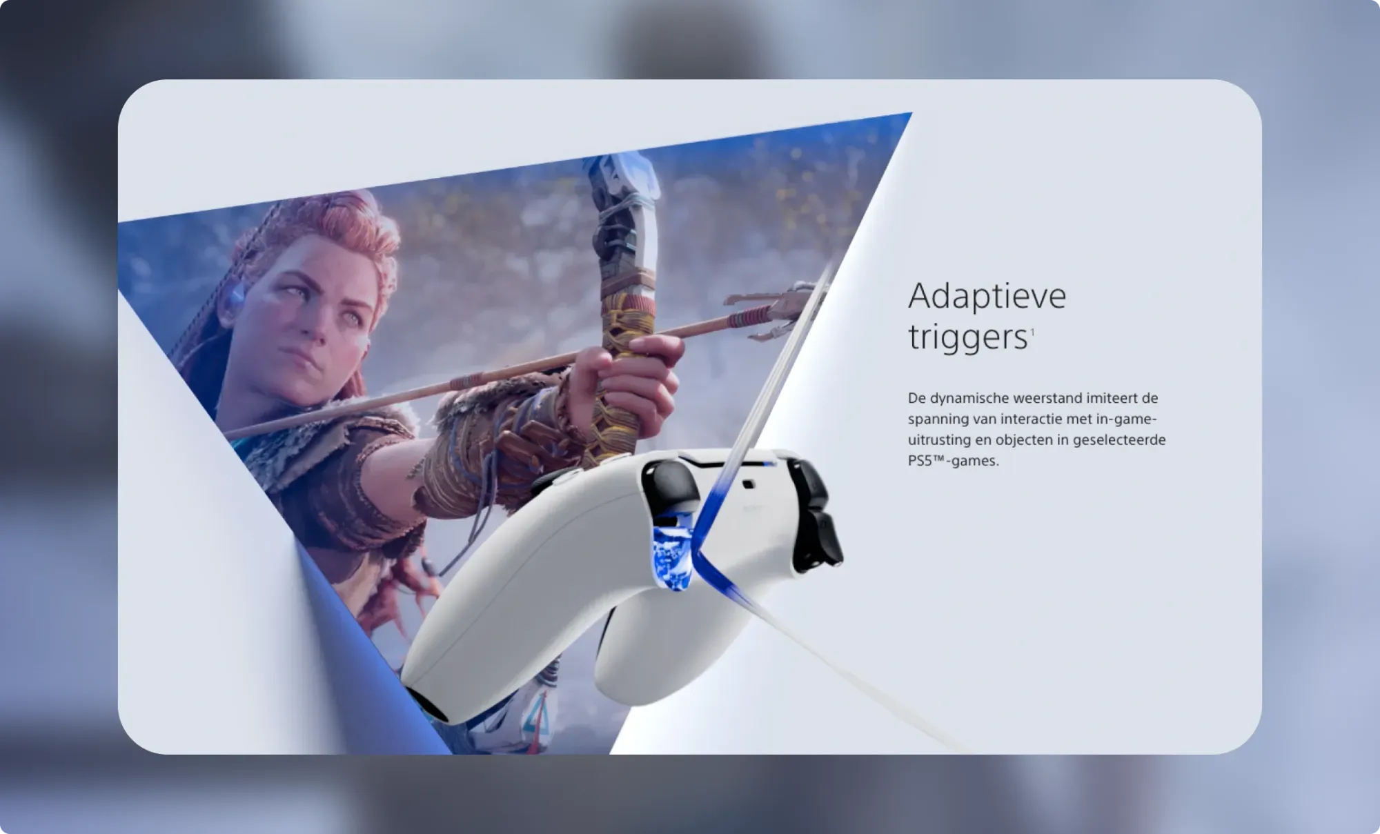
What is it about?
The Playstation 5 is already a lot more powerful than previous versions AND the console has an updated controller, which can vary in vibrations. Those changing vibrations in your hands make the experience of the game much stronger.
What's between the tags?
This sales story is unbalanced, but interesting precisely for that reason. The core story shows visually very nicely the strongest assets of the new controller, but gives a very technical explanation for them. 'Adaptive triggers' and 'Haptic feedback'? It seems you have to have studied on to buy the new Playstation.
Did the company notice too late that something was wrong here? If you are too far into the creation process, it costs a bomb of money to substantially change the concept. Maybe that's why there's just an opening section pasted to this story that actually tells the whole sales story by itself. Here we see a simple image of the console and scroll through to a flat listing of its main strengths, plus a review of some trailers of PS5 games, with a buy button at the top, of course.
Something must have gone wrong in creating this story. Too bad, but instructive at the same time. Evaluate your concept thoroughly before fleshing it out.
The oldest interactive in this list: Hey Google Nest!
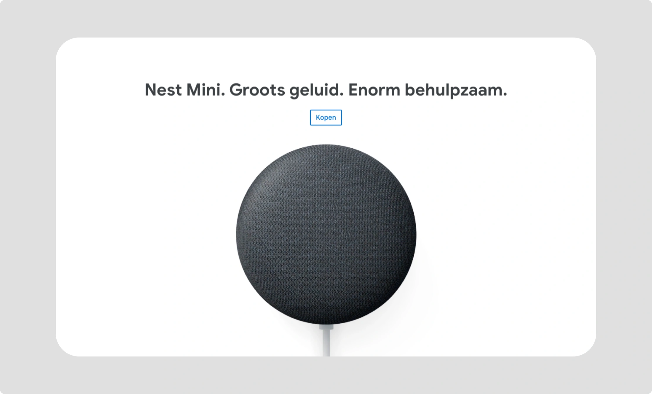
What is it about?
Sales story of the Google Nest Mini, the little sister of the home assistant Google Home.
What's between the tags?
This sales story has been online since at least late 2019, and yet it still has an impact that is pretty okay. The reason is simple: the story applies the basic rules for interactive sales stories of physical products just fine.
- We open with the product name, a tagline and a product image that rises dynamically with the scroll, showing its sympathetic round shape in a fun way.
- Below that product opening, we get a short video loop showing the use case: a dad sitting at the kitchen table with his baby, swinging to the music coming from the Nest Mini on the table.
- In the next scene, we get the assets: better sound, environmentally friendly, better speech recognition. While the text changes when scrolling, the product stays in the same place but changes to illustrate the text, for example with sound waves in the better sound.
- In different scenes, we then go into more detail about the usage aspects, such as the apps you can connect, the simple voice controls.
- Somewhere in the middle, a short scene also overcomes a possible resistance: 'Since you invite us into your home, it is important that we respect your privacy,' with a button to more information. Rhetorically, this is state of the art: you don't wake up sleeping dogs but pay just enough attention to this delicate point for those most sensitive to it.
- The interactive concludes with a choice between different colors of the Nest Mini, and a buy button.
Google has looked very closely at the Apple stories here. The company does not reach the level of the master here, but it probably did not put the same budget into it either.